27/08/25
Download the report
Executive summary
Consult is a tool for analysing public consultations, which uses AI to generate themes for each question and map responses to those themes.
This report outlines findings from an evaluation of Consult using a consultation run by the Department for Work and Pensions on the reform of the health and disability benefits system and employment support.
Headlines:
- We conducted a robust analysis. A total of 87,738 responses to consultation questions were reviewed by 125 people.
- Consult’s theme mappings were consistent with people. Its mapping was more similar to reviewers than reviewers’ mappings were to each other.
- The reviewer made no changes to Consult’s mapped themes for 73% of responses. When two reviewers were compared to each other, they gave identical theme mappings for 65% of responses.
- The overall performance (F1) score was 0.816 (out of 1) when comparing Consult to a single reviewer. When two reviewers were compared to each other, then the equivalent score was 0.710.
- We found no evidence of bias. Consult’s theme mapping performance did not differ with self-reported disability status.
Introduction
Background
What is the Incubator for Artificial Intelligence (i.AI)?
i.AI rapidly designs, tests, and delivers AI products for government. We take pride in being a highly technical team, composed of experts with deep knowledge and experience from both the public and private sector. This allows us to tackle complex challenges and innovate continuously towards our overall mission: to harness the opportunity of AI for public good.
What is Consult?
Each year the government runs around 600 public consultations, with some receiving more than 100,000 responses. Analysing these consultations takes hundreds of thousands of hours of civil service time, or is contracted out at substantial cost. The time-intensive process also delays the findings and, ultimately, the development of policy.
Consult, an AI-powered tool developed by i.AI, aims to alleviate this burden by facilitating quicker analysis, of comparable quality, for a fraction of the cost. It does this using a multi-step process with a human-in-the-loop:
- ‘Theme Generation’: Consult identifies common themes in the responses to generate a list of themes for each question.
- ‘Theme Sign Off’: The policy team running the consultation reviews a long list of generated themes and decides which to use for the analysis, with the ability to add, edit or remove themes.
- ‘Theme Mapping’: Consult classifies the full set of responses using one or more of these generated themes.
Why are we running this evaluation?
Consult has the potential to save substantial time and money for government, but it is critical that this is not at the expense of high quality analysis that captures the public’s views. We are therefore carrying out evaluations to ensure that Consult is suitable for wider use, and continually improving its delivery. We have conducted several retrospective evaluations using historic consultation data. We have also conducted an evaluation on a live consultation from the Scottish Government and a live call for evidence from the Independent Water Commission.
The purpose of this specific evaluation was to gather evidence of Consult’s performance using a sample of responses to help the Department for Work and Pensions (DWP) decide whether to use Consult to analyse the full set of responses when their consultation closed.
This work also builds on our previous evaluations in multiple ways:
- This is the third evaluation we have done on a live consultation or call for evidence, allowing us to better understand how Consult performs in practice.
- Unlike the first live consultation, responses were double reviewed, giving us a better idea of how two people differ when asked to review the same responses.
- This consultation addresses a new topic. To be confident in Consult’s general use, we need to evaluate it across a range of different topics.
- This is the first live consultation for which we have also completed supplementary equality analysis to assess whether Consult exhibits bias.
How does Consult work?
How teams currently analyse consultation responses
Conventional analysis of public consultations is a multi-stage process. Although the approach varies by consultation (for example, based on their size) it generally involves an initial review of a subset of responses to identify common themes. Once these are identified, a team is trained on the theme framework (to ensure they have a common understanding of each theme) before reading through all of the responses and mapping each response to the list of possible themes. At the end, a summary shows how frequently each theme appeared.

How Consult analyses responses with a human in the loop
Consult broadly comprises two steps: theme generation and theme mapping. First, it uses a topic modelling approach to identify common themes for each question (using all the available responses, rather than a sample). It then maps each response to the available themes using Large Language Models (LLMs). The mappings are summarised in a dashboard allowing policymakers to see how often each theme appeared, read the original response content, and synthesise their findings.
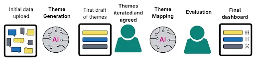
This two stage process allows us to include a ‘human in the loop’ at each stage. In the first stage (theme generation), expert reviewers working on the policy area can review and approve the themes before they are used in the mapping process.
The second stage (theme mapping) was the focus of this evaluation. Reviewers verified (and, if necessary, amended) the theme mappings that Consult provided for each response. Using the Consult application, reviewers were presented with an individual free text response to an individual question and the themes that Consult had mapped to it. If they deemed it necessary, reviewers made changes to the themes which Consult had mapped to the response using the tickboxes. Once they were content with the set of themes mapped to the response, they saved the mapping and continued to the next response. You can see a hypothetical example below.
Fig 1: Example of the interface used by reviewers to assess and amend themes.

The theme mapping evaluation was conducted in two phases using 125 reviewers in total.
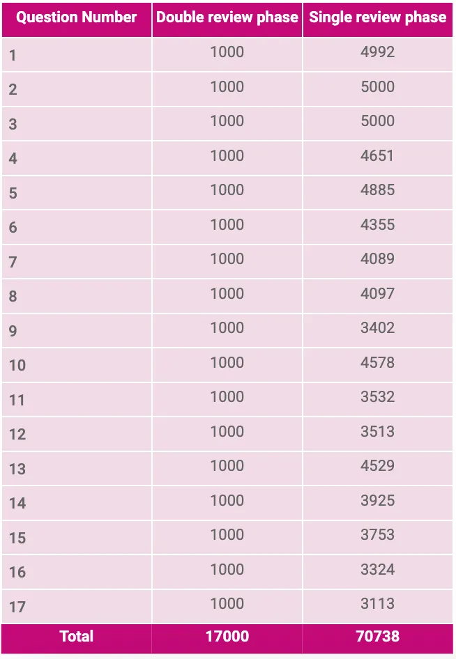
- In the first ‘double review’ phase, two reviewers independently judged the mapping that Consult had provided for a sample of 1000 responses for each of the 17 questions in the consultation.
- In the second ‘single review’ phase, one reviewer assessed the mapping that Consult had provided for up to 5000 responses for each question. If there were not yet 5000 responses for a given question, then the full set of available responses were used (details in the Annex).
Between the two phases, experts working on the policy area provided further feedback on the themes for each question.
All of our code is open source
We have two open source repositories:
- ThemeFinder is a python package containing the AI capabilities (theme generation and mapping). We separated these into their own package to make it easier to test, develop and share with others.
- Consult is our application, containing an interface for both evaluation and the final dashboard. We plan to continue developing and improving this into a self-serve tool.
Research questions
This evaluation was focussed on answering four questions about Consult’s efficacy:
- How similarly do two people map themes to responses?
- How similarly does Consult map themes to the reviewers?
- To what extent do differences between Consult and the reviewers impact the headline findings of the consultation?
- Does Consult’s performance differ by disability status?
Theme mapping evaluation
Methodology
Once the assigned themes had been reviewed, we had a dataset that included (for each response) the themes that were assigned by Consult and the themes assigned by the reviewer(s).
Table 1: Illustrative data snippet (theme names replaced with letters for simplicity).

Research questions
Our main analysis aimed to answer the following questions:
- How aligned were the Consult-mapped themes with the reviewer-mapped themes?
- To what extent do differences between Consult and the reviewer themes impact the implied headline findings?
For every response, we also gave the reviewers the opportunity to choose the following two options (which were not available to Consult):
- ‘None of the above’: The response discusses a topic not covered by the listed themes.
- ‘No reason given’: The response does not provide a substantive answer to the question.
As well as providing us with useful data for our equality analysis (details provided in a subsequent section), this also helped us get an indication of whether the theme framework (which had been signed off after expert feedback) was missing themes which covered a large proportion of responses.
Finally, we used data from Consult to answer the question:
- How long did it take reviewers to review Consult’s theme mappings?
For our analysis, we primarily investigated two comparisons.
- Using the data from the ‘double review’ phase, we compared Reviewer 1 to Reviewer 2 to estimate a ‘baseline’ level of person-to-person variation on this inherently subjective task.
- Using the data from the ‘single review’ phase, we compared Consult to a reviewer to assess how aligned the Consult-mapped themes and reviewer-mapped themes were.
Measuring alignment
To assess the alignment between sets of mapped themes, we calculated an F1 score – a common measure of a model’s performance. Broadly, it considers how often the model correctly identifies a theme (a true positive), versus how often it identifies a theme that is not correct (a false positive), or misses a theme that should be there (a false negative). When reporting Consult’s performance, we take the reviewer-identified themes to be the ‘correct’ answer, and compute the F1 score against this standard. We used a multi-label F1 score that can credit partial matches (where one theme is correct but another is not), and penalises both false positives and false negatives.
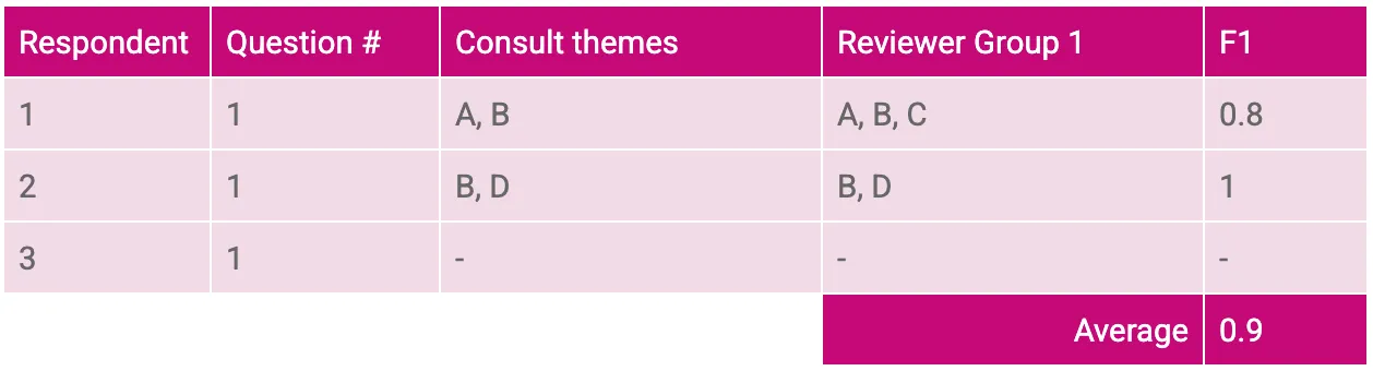
We calculate the F1 score at a response level, and then average across all the responses. For example, row 1 below has an F1 score of 0.8 and row 2 has a score of 1 (perfect alignment), so the average score is 0.9. By calculating the score at a response level and averaging them, longer responses with more themes do not disproportionately drive the score.
Table 2: Example F1 score calculation for a single pairwise comparison.
For a fuller explanation of the F1 score and how it is calculated, see the Annex.
However, for responses with no identified themes (row 3 above) it is not possible to define an F1 score, so these responses are dropped from the calculation.
Theme ranking
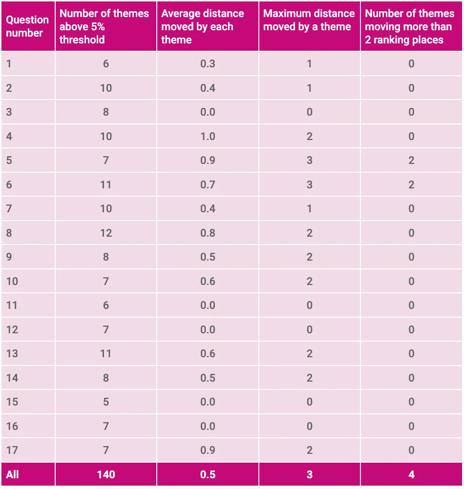
Whilst the number of responses mapped to each theme is important, the qualitative interpretation of the consultation is driven more by their relative frequency (e.g. whether one theme is more prevalent than another) than the absolute numbers. We used the respective theme frequency rankings as a proxy for the expected qualitative interpretation implied by Consult’s theme mappings and the reviewers’ theme mappings. To understand the extent to which the changes made by the reviewers affected these rankings we calculated the difference in rank for each theme. We used these differences to calculate both the ‘average distance moved’ and the ‘maximum distance moved’. The lower these distances are, the more confident we can be that the same qualitative insights would be drawn from the consultation as a whole using either set of mappings. For this analysis, we excluded infrequent themes (those with fewer than 5% of the responses for that question mapped to them) to avoid instances where small changes in frequency lead to misleadingly large changes in the rank. This matches the intuition that low frequency themes would not impact the overall interpretation of the consultation as much as high frequency themes.
Time taken
As the theme mapping evaluation was conducted using the Consult application, we were able to store the timestamp when each response was first seen by a reviewer. We used this to calculate the duration between consecutively reviewed responses to get a proxy for the time taken to check the theme mapping provided by Consult.
Findings
Consult had good overall performance, and produced mappings that were more aligned with a single reviewer than two reviewers’ mappings were to each other.
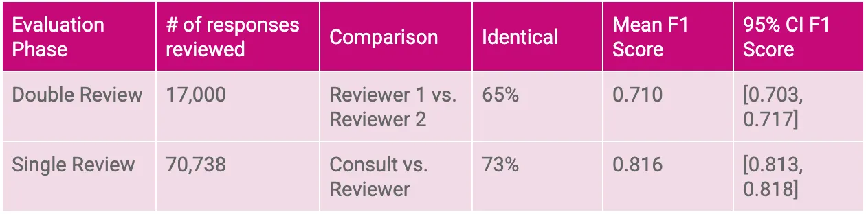
During the single review phase of the evaluation, the themes mapped by Consult were unchanged by the reviewer for 73% of responses. This is higher than the consistency observed during the double review phase where the two reviewers gave identical theme mappings to each other 65% of the time.
Summarising performance across all the responses checked in the single review phase, the mean F1 score for Consult was 0.816. Again, this is higher than the equivalent score when comparing two reviewers, which was 0.710.
There is no set definition of a ‘good’ F1 score: some sources suggest 0.8-0.9 is good, others over 0.7, and some suggest even lower scores may be considered good in specific contexts. However, the fact that Consult achieves a higher score than the person-to-person baseline suggests that, at minimum, Consult’s mapping performance is as good as a human process.
Table 3: Summary of theme mapping performance.
Mean F1 scores by question, and with bootstrapped sampling distributions, are in the Annex.
Differences between Consult and the reviewers had minimal effects on the overall theme rankings.
From a policy perspective, identifying the most common themes in a consultation is usually more important than knowing the exact number of times each theme appeared. We would be more concerned, for example, if differences in theme mapping led to the top theme shifting to third place, than if the most common theme was consistent but was counted 280 times rather than 300 times. Comparing the theme rankings resulting from Consult’s mapping and those resulting from the reviewers’ mapping (during the single review phase), we find some differences but they are generally small with themes moving, on average, half of a rank.
Table 4: Movement of theme rankings by question.
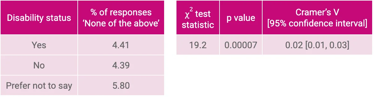
Reviewers used ‘None of the above’ for 4.5% of responses.
When reviewers select ‘None of the above’ they are conveying that a response contained a substantive answer to the question that belonged to a theme not included in the listed themes. The fact that ‘None of the above’ was mapped to fewer than 5% of responses in the single review phase suggests that the agreed list of themes was sufficiently exhaustive. This is a proxy evaluation of the theme generation and sign-off processes which reassures us that no commonly occurring themes were overlooked.
Reviewers were more likely to add themes than remove them.
Inspecting the specific changes made by the reviewers during the single review phase of the evaluation, almost three times as many theme mappings were added (19,047) as were removed (6,498). This pattern was consistent across the different questions. This suggests that the reviewers erred more on the side of including themes than Consult does.
Reviewing themes generally took little time, but there was some variation to account for response complexity.
The median time taken to review a response was 19 seconds, with 78% of responses reviewed in less than a minute. The time taken to review responses was related to the length of the response and the number of changes reviewers made to the theme mapping. This suggests that, while the review process was quick, reviewers did take the time needed to assess longer and more complex answers.
Table 5: Length of response and average theme changes by time taken to review.
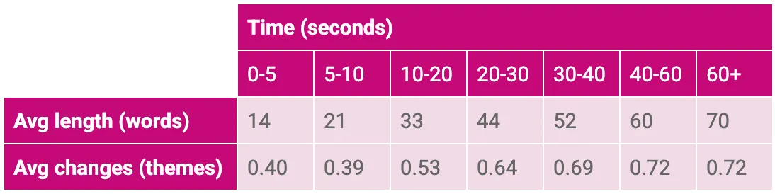
Fig 2: Histogram of time taken to review responses (below 90th percentile).

Equality analysis
Methodology
After they had provided their answers to the 17 questions comprising the consultation, respondents were also asked to provide a limited amount of demographic information. One question posed in this section was, “Do you consider yourself to have a health condition or disability?” to which respondents could answer “Yes”, “No”, or “Prefer not to say”. For all the responses where we had demographic information, we used it to perform supplementary analysis investigating whether Consult exhibited any bias with respect to this self-reported disability status.
Research questions
The first two research questions our equality analysis aimed to answer straightforwardly relate to the theme mapping step in the Consult process:
- Does the rate at which reviewers make changes to Consult’s mappings differ by disability status?
- Does Consult’s performance (i.e. mean F1 score) differ by disability status?
Additionally, we aimed to answer a research question which constitutes a proxy evaluation of the theme generation step in the Consult process:
- Does the rate at which reviewers assign ‘None of the above’ differ by disability status?
We know that theme generation must necessarily be a condensation exercise to make the analysis of the responses intelligible. However, we would be concerned if the views of respondents with particular demographic characteristics were less likely to be included in the final list of themes used for the mapping step of the Consult process. We can use the data provided by the reviewers to assess the extent to which this is occurring. This is because by selecting ‘None of the above’ reviewers are conveying that a response contained a substantive answer to the question that belonged to a theme not covered by the listed themes.
Measuring differences in the ‘None of the above’ rate
To investigate whether the proportion of responses which were mapped to ‘None of the above’ was associated with disability status, we calculated a contingency table and performed a Chi-squared test of association. This test compares the observed frequencies in our data with the frequencies that would be expected if disability status and the probability of a response being mapped to ‘None of the above’ were truly independent.
We calculated a p-value for the test. This tells us the probability of observing the data that we obtained under the assumption of independence. If we observe a low p value, then we might choose to make the inference that the variables are unlikely to be independent. However, with such a large sample size we are very likely to obtain such ‘statistical significance’. As a consequence, our primary metric of interest for this portion of the analysis was instead an effect size (Cramer’s V). This gives us an indication of the potential practical significance of any differences that we observe (irrespective of their ‘statistical significance’).
Findings
‘None of the above’ was used at a similar rate for those who report having a disability and those who do not.
The rate at which ‘None of the above’ was assigned by reviewers is almost identical for respondents who answered “Yes” and “No” to the disability status question, whilst the rate is slightly higher for those who answered “Prefer not to say”. As expected, our Chi-squared test of association yields a very small p-value. However, we can see that this statistical significance does not translate into practical significance. This is evident from the value of 0.02 for our effect size which is considerably below the 0.1 threshold that is conventionally held to indicate a ‘small’ effect (Cohen, J. (1998) Statistical Power Analysis for the Behavioral Sciences. Chapter 7.).
Table 6. ‘None of the above’ rate by disability status and the results of Chi-squared test.
Consult’s theme mapping performance does not differ with disability status.
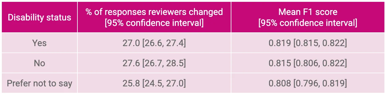
The rate at which reviewers made changes to Consult’s mapped themes is very similar for respondents who answered “Yes” and “No” to the disability status question. It is slightly different for those who answered “Prefer not to say” but the confidence interval for this group still overlaps with the confidence intervals for the other two groups. Additionally, the rate is slightly lower for the “Prefer not to say” group which is intuitively less concerning as it implies better performance. Similarly, the overlap observed in the confidence intervals for the mean F1 scores for each of the three disability status groups reassures us that Consult’s theme mapping performance is broadly equivalent.
Table 7. Performance metrics by disability status.
Conclusion
Consult is an effective tool for mapping themes to responses.
- Consult’s theme mappings were consistent with people. Its mapping was more similar to reviewers than reviewers’ mappings were to each other.
- During the single review phase of the evaluation, the reviewer made no changes to Consult’s mapped themes for 73% of responses. When two reviewers were compared to each other, they gave identical theme mappings for 65% of responses.
- The overall performance (F1) score was 0.816 (out of 1) when comparing Consult to a single reviewer. When the reviewer groups were compared to each other, then the equivalent score was 0.710.
- Differences between Consult and reviewer-mapped themes had minimal impact on the overall theme rankings, implying similar qualitative interpretations.
Consult’s theme mapping performance does not differ with disability status.
- The rate at which ‘None of the above’ was assigned by reviewers is almost identical for respondents who answered “Yes” and “No” to the disability status question at 4.41% and 4.39% respectively.
- The overlap in the confidence intervals for the mean F1 scores across the three disability status groups indicates that Consult’s theme mapping performance is generally comparable for respondents with and without disabilities.
Annex
Supplementary figures
Figure 3: Mean F1 scores per comparison with bootstrapped sampling distributions.

Figure 4: Mean F1 scores per question and comparison with 95% confidence intervals.

Supplementary tables
Table 8: Number responses reviewed by question.
Theme stability check (A.k.a. ‘Dip Test’)
Due to the practical constraints of the consultation period, it was necessary for DWP to begin using Consult to generate and map themes (for the purpose of evaluation) before the consultation had closed. This is no different than the way in which themes are generated in the current, manual consultation analysis process (in fact, using Consult allowed DWP to start generating themes later than usual). However, it still created a risk that the themes that were generated (and used to evaluate Consult’s mapping) may not be representative of the full set of responses that Consult would later be used to analyse. This is an example of the phenomenon known as ‘data drift’ in machine learning engineering where the data used for model training and evaluation are not representative of the future data the model will be expected to handle when deployed. To alleviate this risk we conducted a small ‘Dip Test’ evaluation after the consultation had closed, in which Consult’s theme mappings for 200 responses to each question were assessed by a single reviewer.
Table 9: Summary of theme mapping performance (including the ‘Dip Test’).
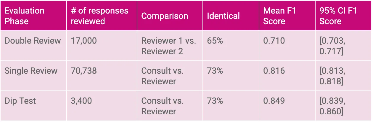
The results of the 'Dip Test', with a mean F1 score of 0.849, indicate that Consult’s theme mappings remain highly consistent with human labellers. This suggests that, despite starting theme generation before the consultation closed, Consult’s outputs are reliably representative of the entire set of responses. The high level of agreement provides reassurance that any potential impact of data drift on the analysis is minimal and supports the decision to use Consult to analyse the full consultation.
Figure 5: Mean F1 scores per comparison with bootstrapped sampling distributions (including the ‘Dip Test’ results).

Figure 6: Mean F1 scores per question and comparison with bootstrapped confidence intervals (including the ‘Dip Test’ results).

Campaign results
In addition to the analysis of the main consultation responses, Consult was also used to map the responses submitted to a third-party website-related campaign. This involved using Consult to map responses to the following three free text questions:
- Question 3. "What impact would losing PIP have on your life, or on someone you care for?"
- Question 7. "Is there anything else you'd like to say about these changes or how the government can better support sick and disabled people?"
- Question 9. "Is there anything else you'd like to say about PIP or how the government can better support sick and disabled people?"
Our evaluation of Consult’s performance on these responses followed the same structure as the evaluation we conducted on the main consultation responses. That is, we again completed an initial ‘double review’ phase (of 1000 responses per question) followed by a subsequent ‘single review’ phase (of 500 responses per question).
Figure 7: Mean F1 scores per comparison with bootstrapped sampling distributions for campaign responses.

The results from the double review phase indicated that Consult’s performance, with F1 scores of approximately 0.46 and 0.42 when compared to human labellers, is slightly below the agreement observed between the human labellers themselves (F1 score of around 0.48). Though it is worth noting that we do see some overlap of confidence intervals. Notably, all three pairwise comparisons yielded relatively moderate F1 scores in absolute terms.
However, in the follow-up single review phase, Consult’s performance improved markedly when compared to a single human labeller, achieving an F1 score of approximately 0.86 with a confidence interval from 0.84 to 0.87. Taken together, these findings are sufficiently encouraging, indicating that Consult’s performance matches, and potentially surpasses, the typical level of agreement seen between human labellers.
Figure 8: Mean F1 scores per question and comparison with bootstrapped 95% confidence intervals for campaign responses.

Calculating the multi-label F1 score
Defining common terms
This annex provides a more detailed explanation of the multi-label F1 score that we used to assess the performance of Consult relative to the reviewers.
To clarify the definition, we can first define some common terms using the classic 2x2 confusion matrix setup.
- Note that we’re only using the simpler 2x2 case to make our initial definitions clearer. In the actual analysis we also extended the metric to the multi-label case.

Building on the 2x2 matrix above, we can define eight ratios that help us characterise the performance of our classifiers (i.e. the output from the reviewers and Consult):

F1 score
The F1 score combines two of the eight ratios from the table above, True Positive Rate and Positive Predictive Value, to give an aggregated measure of performance in relation to the ‘positive’ class. Specifically, F1 score is the harmonic mean of the True Positive Rate (TPR) and the Positive Predictive Value (PPV):
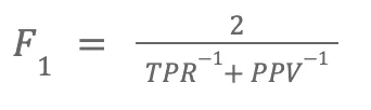
During our evaluation, more than one theme could be mapped to a given response. This meant that we were evaluating a multi-label classification problem and needed to adjust our metric accordingly.
To do this, we converted the theme mappings into sparse matrices where each column represented one of the theme labels that could have been chosen and each row represented a response to the consultation. We then calculated the F1 score for each individual response and averaged these scores to get the aggregate values reported. The benefit of this approach is that each response contributes equally to our assessment of performance.
This process is illustrated in the hypothetical below:
- Imagine that there were four possible themes (A, B, C, D), and for a particular response we received the following mappings from our labellers:
- Reviewer = (A, C)
- Consult = (A)
- We would convert the data into sparse matrices with a column per possible topic:
- Reviewer = (1, 0, 1, 0)
- Consult = (1, 0, 0, 0)
- We would calculate the True Positive Rate and Positive Predictive Value for this response:
- TPR = 0.5
- There are two ‘actual positives’ in the reviewer’s answer.
- Consult has correctly ‘predicted’ one of them.
- PPV = 1
- There is one ‘predicted positive’ in Consult’s answer.
- This predicted positive is ‘correct’ according to the reviewer.
- TPR = 0.5
- We would calculate the F1 score for this response using the formula above:

- This process would be repeated for all the responses and the arithmetic mean of the response-level F1 scores would be calculated.
We calculated this statistic using a function from scikit-learn’s metrics module: f1_score().
Confidence intervals
In addition, we generated a confidence interval for the F1 score using a process called bootstrapping. This involved taking a large number of random samples of responses from the data and calculating the F1 score for each of these samples. This process gave us an approximate sampling distribution for the metric itself. Confidence intervals can be extracted from this sampling distribution by finding the relevant percentiles. We calculated 95% confidence intervals by finding the 2.5th and 97.5th percentiles. The confidence interval gives us a sense of the uncertainty we have in our metric.