Executive summary
Consult is a tool for analysing public consultations, which uses AI to generate themes for each question and map responses to those themes. It alleviates the burden of running consultations by facilitating quicker analysis for a fraction of the cost.
This report outlines findings from an evaluation of Consult using a Call for Evidence from the Independent Water Commission on the water sector in England and Wales.
Headlines:
- Consult’s theme mappings were consistent with human reviewers. Its mapping was more similar to each of the reviewer groups than the reviewer groups were to each other.
- At least one reviewer made no changes to Consult’s mapped themes for 83% of responses.
- The overall performance (F1) scores were 0.79 and 0.82 (out of 1) when comparing Consult to two groups of reviewers. When the reviewer groups were compared to each other, the equivalent score was 0.74.
- Consult accurately mapped 89% of responses’ positions (broad agreement or disagreement with a given question). More than half of the discrepancies present occurred when Consult had labelled a response’s position as ‘Unclear’.
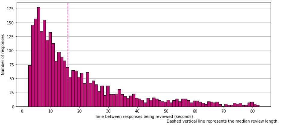
- Reviewing Consult themes is quick, with a median time of 16s per response.
- For 12% of responses reviewers added a ‘New theme’, suggesting the original theme list was not exhaustive.
Introduction
Background
What is the incubator for Artificial Intelligence (i.AI)?
i.AI rapidly designs, tests, and delivers AI products for government. We take pride in being a highly technical team, composed of experts with deep knowledge and experience from both the public and private sector. This allows us to tackle complex challenges and innovate continuously towards our overall mission: to harness the opportunity of AI for public good.
What is Consult?
Each year the government runs around 600 public consultations, with some receiving more than 100,000 responses. Analysing these consultations takes hundreds of thousands of hours of civil service time, or is contracted out at substantial cost. The time-intensive process also delays the findings and, ultimately, the development of policy.
Consult, an AI-powered tool developed by i.AI, aims to alleviate this burden by facilitating quicker analysis, of comparable quality, for a fraction of the cost. It does this using a two stage process:
‘Theme Generation’: Identify common themes in the responses to generate a list of themes for each question.
- As part of this process, responses are also identified as being either in “Agreement” or “Disagreement” with the proposal of the question (or “Unclear”). We refer to this as the response’s ‘Position’.
‘Theme Mapping’: Classify the full set of responses using one or more of these generated themes.
Why are we running this evaluation?
Consult has the potential to save substantial time and money for government, but it is critical that this is not at the expense of high quality analysis that captures the public’s views. We are therefore carrying out evaluations to ensure that Consult is suitable for wider use, and continually improving its delivery. We have conducted several retrospective evaluations using historic consultation data. We have also conducted an evaluation on a live consultation from the Scottish Government.
The purpose of this specific evaluation was to gather evidence of Consult’s performance using a sample of responses to help the Independent Water Commission decide whether to use Consult to analyse the full set of responses when their Call For Evidence closes.
This work also builds on our previous evaluations in multiple ways:
- This is the second evaluation we have done on a live consultation or Call for Evidence, allowing us to better understand how Consult performs in practice.
- Unlike the first live consultation, responses were double reviewed, giving us a better idea of how two people differ when asked to review the same responses.
- This is the first time we are also evaluating “Position” - whether a response agrees or disagrees with the proposal in the question.
- This Call for Evidence addresses a new topic. To be confident in Consult’s general use, we need to evaluate it across a range of different topics.
How does Consult work?
How teams currently analyse consultation responses
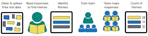
Conventional analysis of public consultations is a multi-stage process. Although the approach varies by consultation (for example, based on their size) it generally involves an initial review of a subset of responses to identify common themes. Once these are identified, a team is trained on the theme framework (to ensure they have a common understanding of each theme) before reading through all of the responses and mapping each response to the list of possible themes. At the end, a summary shows how frequently each theme appeared.
How Consult analyses responses with a human in the loop
Consult broadly comprises two steps: theme generation and theme mapping. First, it uses a topic modelling approach to identify common themes for each question (using the whole dataset, rather than a sample). It then maps each response to the available themes using LLMs. We are developing a dashboard to summarise the findings, allowing policymakers to see how often each theme appeared, as well as more nuanced metrics such as the overlap between themes.
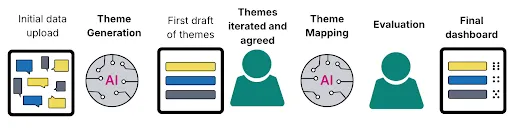
This two stage process allows us to include a ‘human in the loop’ at each stage. ‘Human in the loop’ is when human review and decision-making is incorporated into an AI process. This ensures that the outputs are regularly checked, and aims to improve the quality of the process. In the first stage (theme generation), expert reviewers working on the policy area can review and approve the themes before they are used in the mapping process.
The second stage (theme mapping) was the focus of this evaluation. Reviewers verified (and, if necessary, amended) the theme mappings that Consult provided for each response. Using the Consult application, reviewers were presented with an individual free text response to an individual question and the themes that Consult had mapped to it. If they deemed it necessary, reviewers made changes to the themes which Consult had mapped to the response using the tickboxes. Once they were content with the set of themes mapped to the response, they saved the mapping and continued to the next response. You can see a hypothetical example below. For this evaluation, this involved 15 expert reviewers, arranged into 2 groups, who split the responses between them.
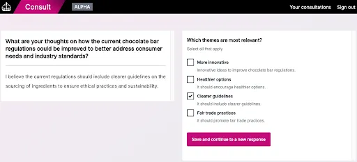
In addition to verifying the themes mapped to a response, the reviewers also verified the “Position” assigned to a response. This exercise was completed using Microsoft Excel spreadsheets as there was not sufficient time to build this information into the application itself.
All of our code is open source
We have two open source repositories:
- ThemeFinder is a python package containing the AI capabilities (theme generation and mapping). We separated these into their own package to make it easier to test, develop and share with others.
- Consult is our application, containing a UI for both evaluation and the final dashboard. We plan to continue developing and improving this into a self-serve application.
Research questions
This evaluation was focussed on answering five key questions:
- To what extent do people identify new themes not included in the list?
- How similarly do two people map themes to responses?
- How similarly does Consult map themes to the reviewers?
- To what extent do differences between Consult and the reviewers impact the headline findings of the Call for Evidence?
- How accurately does Consult map response position?
Theme mapping evaluation
Methodology
Once the assigned themes had been reviewed, we had a dataset that included (for each response) the themes that were assigned by Consult and the themes assigned by our reviewers.
Research questions
Our main analysis aimed to answer the following questions:
- How aligned were the Consult-mapped themes with the reviewer-mapped themes?
- To what extent do differences between Consult and the reviewer themes impact the implied headline findings?
For every response, we also gave the reviewers the opportunity to suggest a new theme, using the “New Theme: The response contained themes not covered by the existing categories“ tickbox (this label could not be used by Consult). This was to help us answer the following research question:
- Was the theme framework missing themes that should have been included?
Finally, we used data from Consult to answer the question:
- How long did it take reviewers to review the Consult themes?
For all our analysis, we investigated three pairwise comparisons: Reviewer Group 1 vs. Reviewer Group 2, Consult vs. Reviewer Group 1, and Consult vs. Reviewer Group 2.
Consult / reviewers alignment
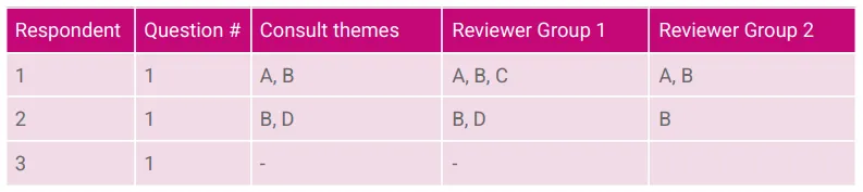
To assess the alignment between Consult and the reviewer-identified themes, we calculated an F1 score – a common measure of a model’s performance. Broadly, it considers how often the model correctly identifies a theme (a true positive), versus how often it identifies a theme that is not correct (a false positive), or misses a theme that should be there (a false negative). We take the reviewer-identified themes to be the ‘correct’ answer, and compute the F1 score against this standard. In reality, there is nothing saying the reviewer label is ‘correct’. Theme mapping is often subjective, and we use the reviewer-to-reviewer comparison as our baseline to put scores in context. We used a multi-label F1 score that can credit partial matches (where one theme is correct, but another is not), and penalises both false positives and false negatives.
We calculate the F1 score at a response level, and then average across all the responses. For example, row 1 below has an F1 score of 0.8 and row 2 has a score of 1 (perfect alignment), so the average score is 0.9. By calculating the score at a response level and averaging them, longer responses with more themes don’t disproportionately drive the score. However, for responses with no identified themes (row 3) it is not possible to define an F1 score, so these responses are dropped from the calculation. We could assign these rows a value of 1, given the Consult and Reviewer themes are the same. However, an F1 score does not consider ‘true negatives’ like these. While there is an argument that Consult ‘correctly’ didn’t assign any themes, we have excluded these rows to avoid biasing our estimates upwards.
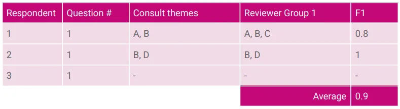
For a fuller explanation of the F1 score and how it is calculated, see the Annex.
Theme ranking
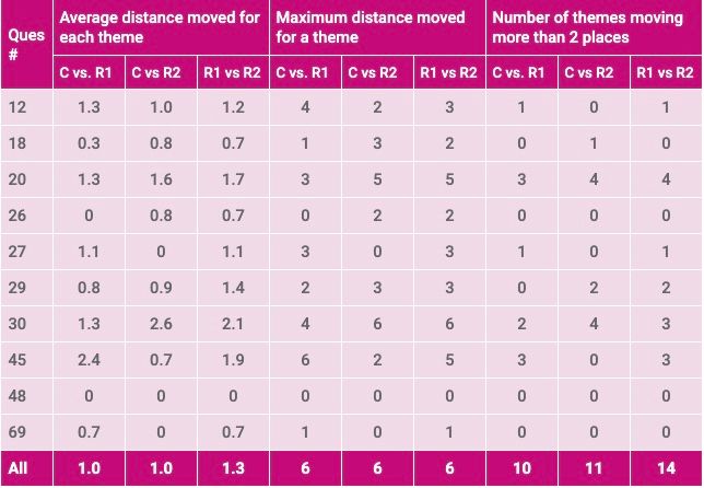
Whilst the number of responses mapped to each theme is important, the qualitative interpretation of the Call for Evidence is more driven by their relative frequency (i.e. whether a theme is more prevalent than another) than the absolute numbers. We used the respective theme frequency rankings as a proxy for the expected qualitative interpretation implied by Consult’s theme mappings and the reviewers’ theme mappings. To understand the extent to which the changes made by the reviewers affected these rankings we calculated the difference in rank for each theme. We used these differences to calculate both the ‘average distance moved’ and the ‘maximum distance moved’. The lower these distances are, the more confident we can be that the same qualitative insights would be drawn from the Call for Evidence as a whole using either set of mappings. For this analysis, we excluded infrequent themes (those with fewer than 5% of the responses for that question mapped to them) to avoid instances where small changes in frequency lead to misleadingly large changes in the rank. This matches the intuition that low frequency themes would not impact the overall interpretation of the Call for Evidence as much as high frequency themes.
Time taken
As the theme mapping evaluation was conducted using the Consult app, we were able to store the timestamp when each response was first seen by a reviewer. We used this to calculate the duration between consecutively reviewed responses to get a proxy for the time taken to check the theme mapping provided by Consult.
Findings
Consult had good overall performance, and produced mappings that were more aligned with each reviewer group than the groups were to each other.
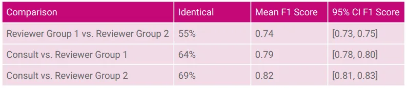
For 64% and 69% of responses respectively, the themes mapped by Consult were unchanged by the reviewers in Group 1 and Group 2. This is significantly higher than the consistency between the two reviewer groups, who gave identical theme mappings to each other 55% of the time.
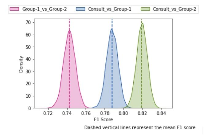
Summarising performance across all responses the mean multi-label F1 score was 0.79 for the comparison of Consult to Group 1 and 0.82 for the comparison of Consult to Group 2. Again, this is higher than the equivalent score comparing the two reviewer groups, which was 0.74.
There is no set definition of a ‘good’ F1 score: some sources suggest 0.8-0.9 is good, others over 0.7, and some suggest even lower scores may be considered good in specific contexts. However, the average score for Consult compared to the reviewers of 0.80 is ‘good’ by even the most conservative of these definitions. The fact that Consult achieves a higher score than the person-to-person baseline also suggests that, at minimum, Consult’s mapping performance is as good as a human process.
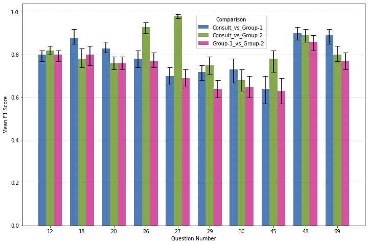
Mean F1 scores by question, and with bootstrapped sampling distributions, are in the Annex.
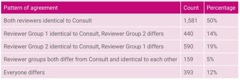
At least one reviewer gave identical theme mappings to Consult for 83% of responses.
In addition to making the pairwise comparisons described above, we can also look at the three sets of theme mappings that we have for each response and consider the pattern of agreement. We find that at least one reviewer gave identical theme mappings to Consult for 83% of responses. There is little evidence that Consult was mislabelling clear responses. The instances where both reviewer groups gave identical mappings and Consult gave a different mapping made up just 5% of responses – the least common combination.
Differences between Consult and the reviewers had minimal effects on the overall theme rankings.
From a policy perspective, identifying the most common themes in a Call for Evidence is usually more important than knowing the exact number of times each theme appeared. We would be more concerned, for example, if differences in theme mapping led to the top theme shifting to third place, than if the most common theme was consistent but was counted 250 times rather than 300 times.
Comparing the theme rankings resulting from Consult’s mapping and those resulting from the reviewers’ mapping, we find some differences but they are generally small with themes moving, on average, one rank. Of the themes included in this portion of the analysis, more than 86% moved by only one place or did not move. Additionally, the differences in rankings from the comparisons of Consult to each of the groups of reviewers are smaller than the difference in rankings from the comparison of the reviewer groups to each other.
However, there were some outliers that warranted further exploration. For example, when comparing Consult to Reviewer Group 1 on question 45 and Reviewer Group 2 on question 30 the maximum change in rankings was 6 places. For question 45, this large change is driven by a single theme. Consult selected theme F 11 times whilst Reviewer Group 1 did so 29 times. This meant that theme F moved from 8th place in Consult’s rankings to 2nd in Reviewer Group 1’s. In contrast, for question 30, there are wider differences across several themes. The fact that we are able to identify the problem questions and themes will enable us to deploy iterative solutions in the future. This could include changing the themes’ descriptions to align the way Consult and people interpret them.
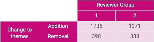
Reviewers were more likely to add themes than remove them.
Inspecting the specific changes made by the reviewers, four times as many theme mappings were added as were removed. This pattern was consistent across the different questions (as shown by the table in the Annex). This suggests that the reviewer groups erred more on the side of including themes than Consult does. However, the general discrepancy between the reviewer groups in comparison to Consult suggests that these additional themes are not always applied consistently across reviewers.
For 12% of responses reviewers added a ‘New theme’, suggesting our original theme list was not exhaustive.
We found that reviewers in Group 1 added a ‘New theme’ for 14% of responses whilst reviewers in Group 2 did so for 10% of responses. If we average these two figures, then it suggests that for roughly 12% of responses Consult’s theme list was not deemed to be exhaustive.
However, there was disagreement between the two reviewer groups about which responses required a ‘New theme’. For the 14% of responses where Group 1 had added a ‘New theme’, Group 2 had also added a ‘New theme’ for around one-third of responses (32%). Similarly, for the 10% of responses where Group 2 had added a ‘New theme’, Group 1 had also added a ‘New theme’ for less than half of responses (43%).
For this evaluation, we did not undertake a comprehensive theme sign off process between Consult’s theme generation and theme mapping steps. This likely contributed to reviewers feeling that some themes were missing. We will complete further analysis to understand the content of the themes that reviewers suggested and the responses that they mapped to them.
Reviewing themes generally took little time, but there was some variation to account for response complexity.
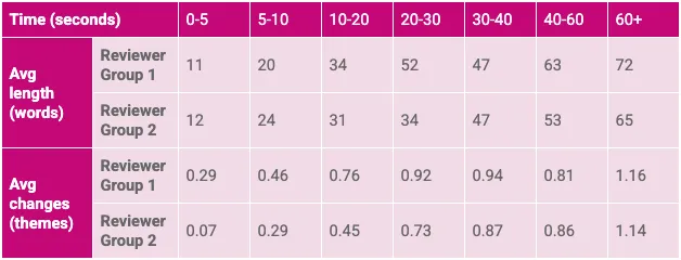
The median time taken to review a response was 16 seconds, with 86% of responses reviewed in less than a minute. The time taken to review responses was related to the length of the response and the number of changes reviewers made to the theme mapping. This suggests that while the review process was quick, reviewers did take the time needed to assess longer and more complex answers.
As two people reviewed each response, we calculated the mean time taken for each response and used this for our analysis unless otherwise stated.
Response position evaluation
Methodology
Once the Consult position mappings had been reviewed, we had a dataset that included (for each response) the position assigned by Consult and the position assigned by our reviewers.
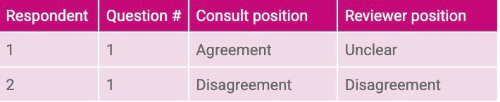
Due to time constraints, and because position was expected to be less subjective than the theme mapping, only one reviewer group was involved in this stage.
In addition, the reviewers from the Independent Water Commission thought that three of the open questions in the Call for Evidence did not lend themselves to a meaningful position mapping.
Question 12. Who do you believe should be responsible for making decisions about what outcomes to prioritise from the water system?
Question 26. What changes, if any, do you consider are needed to the framework of water regulators to improve the regulation of the water industry?
Question 29. How do you think the Price Review process should balance the need to keep customer bills low with the need for infrastructure resilience?
These three questions were excluded from our analysis.
Research question
For this portion of the evaluation, our analysis aimed to answer the following question:
- How accurately does Consult map a response’s position?
Findings
Consult accurately mapped 89% of responses’ positions.
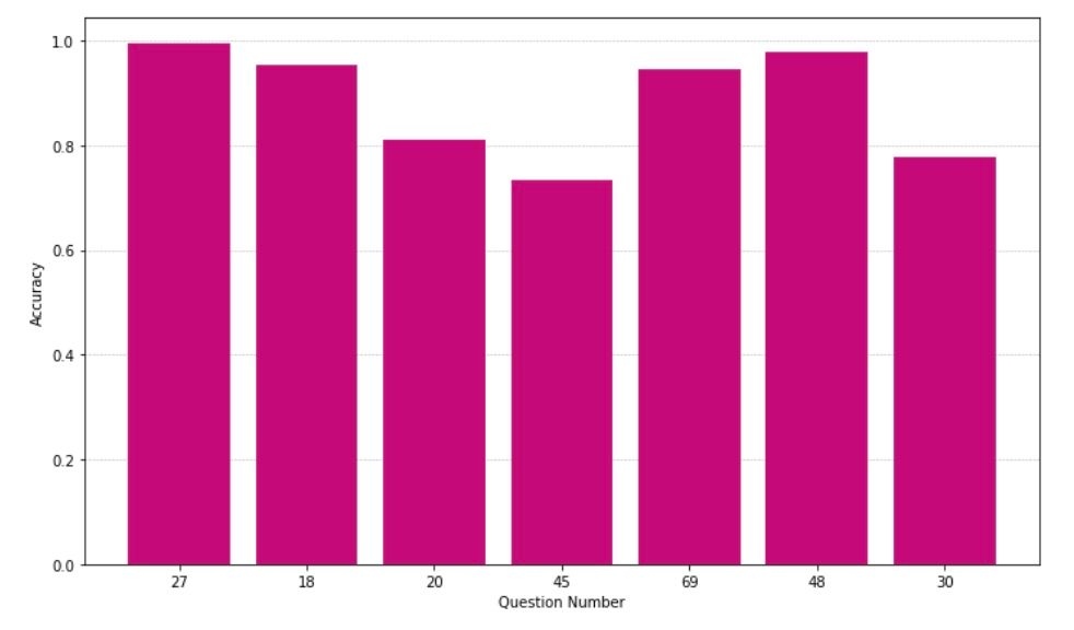
Consult achieved 89% accuracy when compared to the ‘ground truth’ labels provided by the reviewers. This accuracy did vary by question with worse performance on questions 20, 30, and 45. However, these three questions were all phrased in a way that made a response’s position more difficult to map (full text of the questions is available in the Annex).
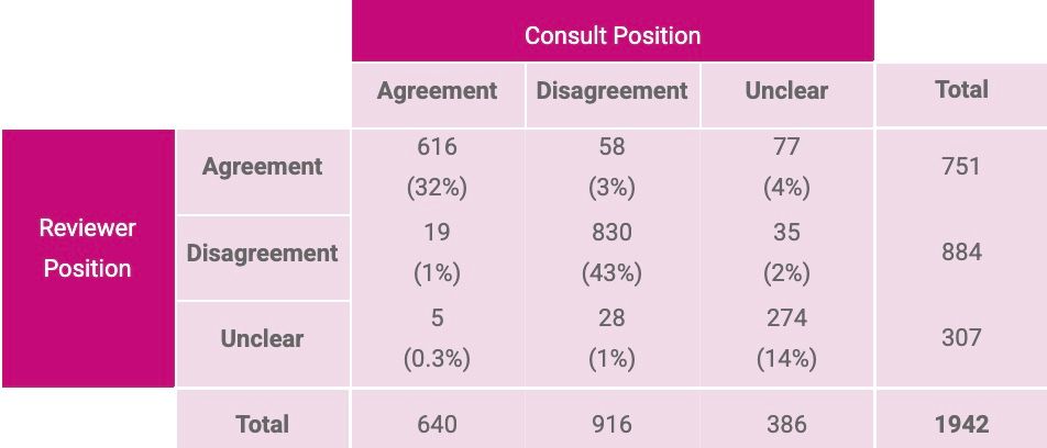
The most common discrepancy was Consult marking a response’s position as ‘Unclear’ when reviewers had deemed it either ‘Agreement’ or ‘Disagreement’.
Consult performed well when it mapped responses as either ‘Agreement’ or ‘Disagreement’ with reviewers agreeing with these mappings 93% of the time (96% and 91% of the time respectively). However, when Consult mapped a response as ‘Unclear’, then its performance was worse with reviewers only agreeing with this mapping 71% of the time. This pattern of performance is indicative of a useful ‘caution’ when Consult is mapping responses to positions. In future, departments could choose to review positions labelled by Consult as ‘Unclear’, as this was just 20% of the sample.
Conclusion
Consult is an effective tool for mapping themes to responses.
- Consult’s theme mappings were consistent with people. Its mapping was more similar to each of the two groups of reviewers than those groups were to each other.
- At least one reviewer made no changes to Consult’s mapped themes for 83% of responses.
- The overall performance (F1) scores were 0.79 and 0.82 (out of 1) when comparing Consult to the two groups of reviewers. When the reviewer groups were compared to each other, then the equivalent score was 0.74.
- Differences between Consult and reviewer-mapped themes had minimal impact on the overall theme rankings, implying similar qualitative interpretations.
Consult is an effective tool for mapping positions to responses.
- Consult accurately mapped 89% of responses’ positions (broad agreement or disagreement with a given question).
- More than half of the discrepancies that were present occurred when Consult had labelled a response’s position as ‘Unclear’.
- When Consult selected ‘Agreement’ or ‘Disagreement’ humans agreed 93% of the time.
However, there are some areas for improvement.
In our future rounds of evaluation, we will prioritise the following:
- Refining the theme sign-off process, focusing on usability and ensuring the correct themes end up in the framework. This could include mapping a small sample as part of the sign-off process. If we can improve this step in the future, then we should reduce the percentage of responses where reviewers indicate that a ‘New theme’ is needed from 12%.
- Testing whether amending specific themes can reduce the discrepancy between Consult and reviewers by aligning their interpretation of the theme descriptions.
Annex
Supplementary figures
Supplementary tables
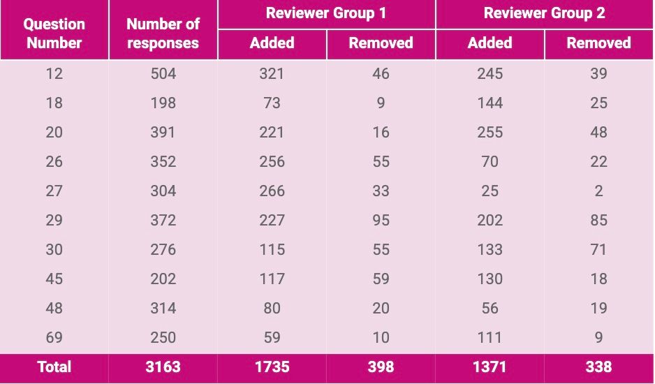
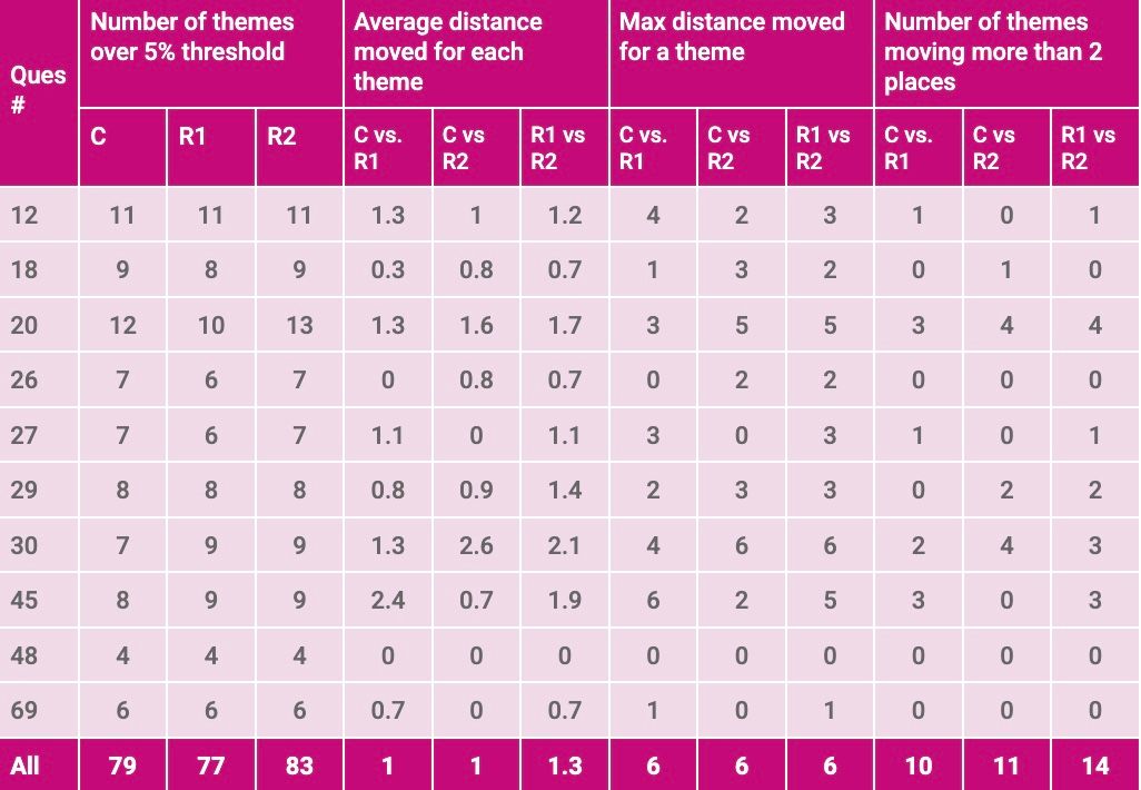
Question list
The 10 questions from the Call For Evidence used as part of this evaluation were:
Q12. Who do you believe should be responsible for making decisions about what outcomes to prioritise from the water system?
Q18. If you feel the WFD Regulations would benefit from change, please expand on where you feel changes are necessary and the reasons why.
Q20. What role do you believe the government can play in providing strategic direction for the water industry?
Q26. What changes, if any, do you consider are needed to the framework of water regulators to improve the regulation of the water industry? Please consider both potential benefits and costs of any proposed changes.
Q27. To what extent do you think the water industry regulators have the capacity, capabilities and skills required to effectively perform their roles?
Q29. How do you think the Price Review process should balance the need to keep customer bills low with the need for infrastructure resilience?
Q30. What, if any, changes could be made to the Price Review process to better enable the water industry to deliver positive outcomes?
Q45. How do financial returns in the water sector compare to other similar sectors (for example, energy)?
Q48. To what extent should further competition in the water industry be encouraged through regulation?
Q69. What impact, if any, does whether or not a water company is listed on the stock exchange have on their performance?
Calculating the multi-label F1 score
Defining common terms
This annex provides a more detailed explanation of the multi-label F1 score that we used to assess the performance of Consult relative to the reviewers.
To clarify the definition, we can first define some common terms using the classic 2x2 confusion matrix setup.
Note that we’re only using the simpler 2x2 case to make our initial definitions clearer. In the actual analysis we also extended the metric to the multi-label case.
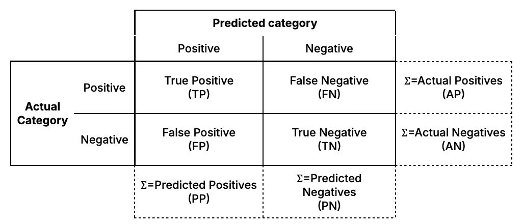
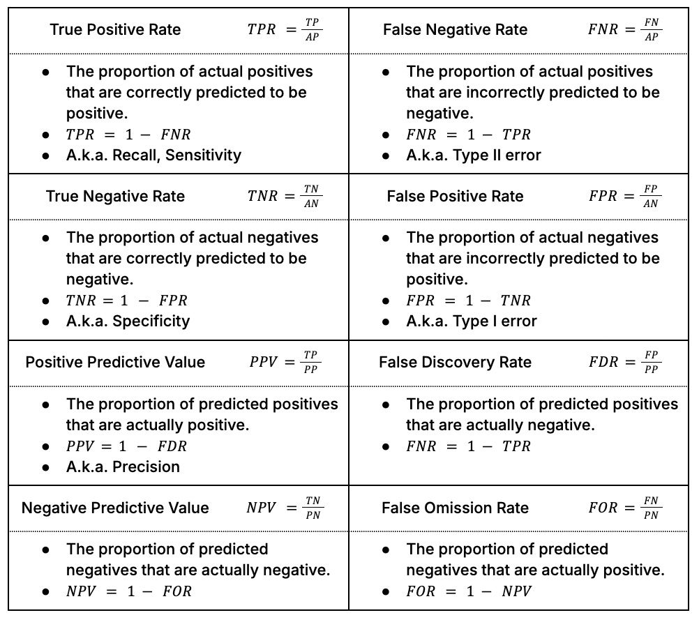
Building on the 2x2 matrix above, we can define eight ratios that help us characterise the performance of our classifiers (i.e. the output from the reviewers and Consult):
F1 score
The F1 score combines two of the eight ratios from the table above, True Positive Rate and Positive Predictive Value, to give an aggregated measure of performance in relation to the ‘positive’ class. Specifically, F1 score is the harmonic mean of the True Positive Rate (TPR) and the Positive Predictive Value (PPV):

During our evaluation, more than one theme could be mapped to a given response. This meant that we were evaluating a multi-label classification problem and needed to adjust our metric accordingly.
To do this, we converted the theme mappings into sparse matrices where each column represented one of the theme labels that could have been chosen and each row represented a response to the Call for Evidence. We then calculated the F1 score for each individual response and averaged these scores to get the aggregate values reported. The benefit of this approach is that each response contributes equally to our assessment of performance.
This process is illustrated in the hypothetical below:
Imagine that there were four possible themes (A, B, C, D), and for a particular response we received the following mappings from our labellers:
- Reviewer = (A, C)
- Consult = (A)
We would convert the data into sparse matrices with a column per possible topic:
- Reviewer = (1, 0, 1, 0)
- Consult = (1, 0, 0, 0)
We would calculate the True Positive Rate and Positive Predictive Value for this response:
TPR = 0.5
- There are two ‘actual positives’ in the reviewer’s answer.
- Consult has correctly ‘predicted’ one of them.
PPV = 1
- There is one ‘predicted positive’ in Consult’s answer.
- This predicted positive is ‘correct’ according to the reviewer.
We would calculate the F1 score for this response using the formula above:

This process would be repeated for all the responses and the arithmetic mean of the response-level F1 scores would be calculated.
We calculated this statistic using a function from scikit-learn’s metrics module: f1_score().
Confidence intervals
In addition, we generated a confidence interval for the F1 score using a process called bootstrapping. This involved taking a large number of random samples of responses from the data and calculating the F1 score for each of these samples. This process gave us an approximate sampling distribution for the metric itself. Confidence intervals can be extracted from this sampling distribution by finding the relevant percentiles. We calculated 95% confidence intervals by finding the 2.5th and 97.5th percentiles. The confidence interval gives us a sense of the uncertainty we have in our metric.